02. Normal Flow
position: static
The Game of Positions starts with this CSS property: position.
position: static;
Let's start with an analogy. Take a look at the image below. The arrows show how currents flow around the Australian continent.
Australian Currents
![© Commonwealth of Australia 2013 [CC BY 3.0 au (http://creativecommons.org/licenses/by/3.0/au/deed.en)], via Wikimedia Commons](img/160005.gif)
© Commonwealth of Australia 2013 [CC BY 3.0 au (http://creativecommons.org/licenses/by/3.0/au/deed.en)], via Wikimedia Commons
normal flow intro
An object floating in the oceans around Australia (like a rubber ducky) would follow the path of the currents.
The Game of Positions actually can be played with a few different sets of rules, which we sometimes call flows because of the way most developers think of elements flowing into place as if they were being pushed by a force, much like the currents flowing around Australia (and every other landmass, for that matter).
So, how does this look with CSS?
.default {
    position: static;
}
The default position is static, which gets called the normal flow. This is what you’ve been using in all of your sites so far. The relative, absolute and fixed flows are variations of the normal flow.
How the Normal Flow Works
The way elements will move in the normal flow depends on their display state as block elements or inline elements.
- Block elements are aligned vertically.
- Inline elements are aligned horizontally.
(Elements don’t actually have a starting point on the screen. I picked the bottom middle arbitrarily. Depending on the flow that you’re using, you might do better thinking that your elements are coming in from the bottom left, or bottom right, or appearing randomly!)
Notice how the <div>s (block elements) stack vertically while the <span>s (inline elements) stack horizontally.
Let's look at another example. Here is some HTML:
<!DOCTYPE html>
<html lang="en">
<head>
  <meta charset="UTF-8">
  <title>Sample Normal Flow</title>
  <style> /* nothing but colors, widths and margins */ </style>
</head>
<body>
  <div>block</div>
  <div>block</div>
  <div>block</div>
  <span>span </span>
  <span>span </span>
  <span>span</span>
  <div>block</div>
</body>
</html>
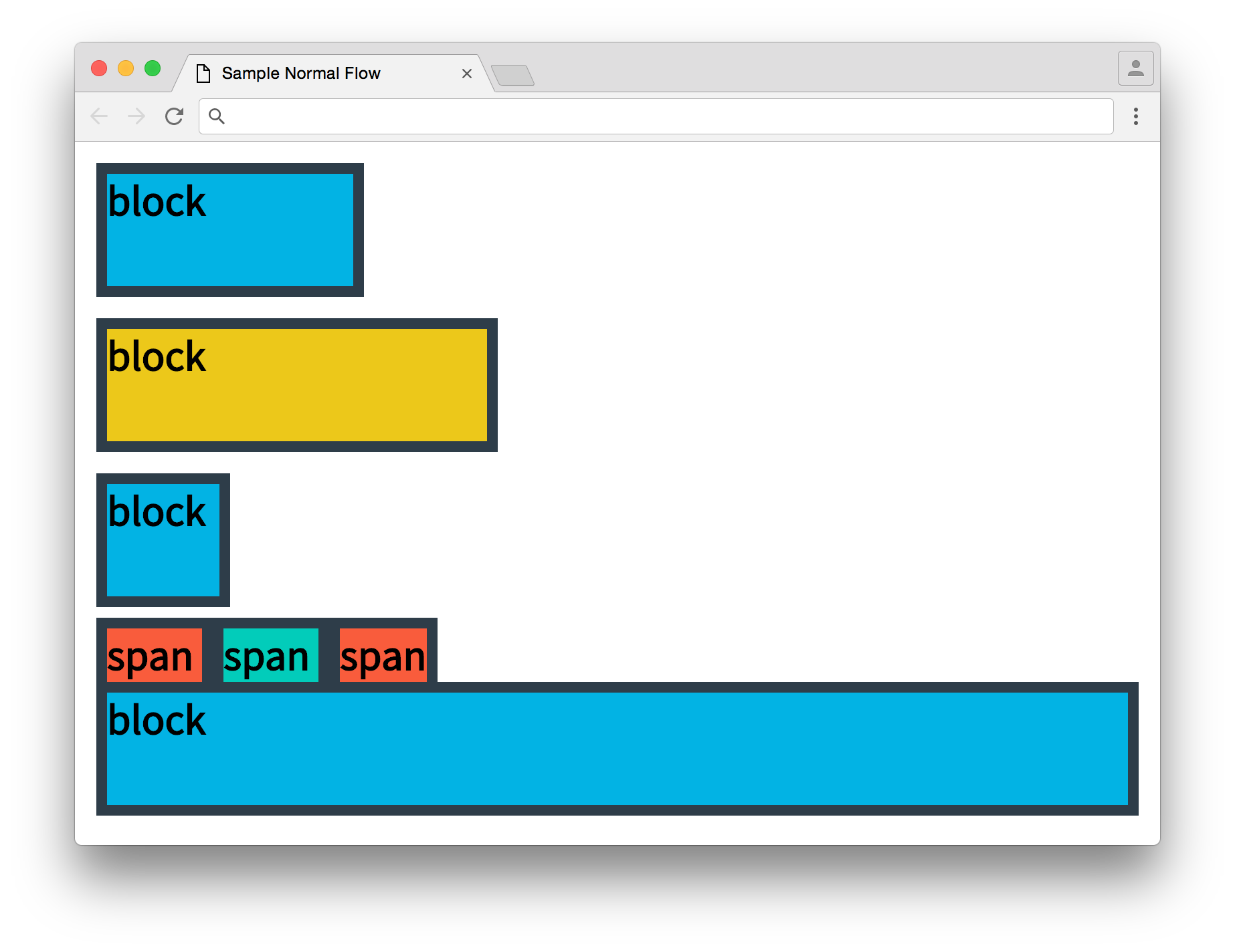
And here is the resulting website:
sample normal flow

Take a look at the way the block elements line up.
Block Align
INSTRUCTOR NOTE:
Block elements are laid out vertically. Their left outer edges will line up with their parent’s left outer edges. Even though these blocks do not take up the full width of the page, they still stack.
Inline Align
INSTRUCTOR NOTE:
part 2
Inline elements are laid out horizontally inside their parents. The left edge of an element’s line box will touch the right edge of the preceding element’s line box.
If a line box is too big for a line, it wraps around to the next line.
And that’s it! The rules of the positioning game are pretty simple by themselves, but they can get complicated when they start building on each other. For instance, take a look at how the spans end up on a line of their own. The block elements seem to treat the inline elements as a whole like a block. There's an interesting reason for this which you'll encounter later in this lesson.